Browsers have become the central hubs of our digital lives, serving as gateways for research, learning, music discovery, and community engagement. They provide access to an unprecedented wealth of information and resources. Yet despite this vast digital landscape at our fingertips, the browser history interface remains stuck in a model that no longer reflects how users move through the web. Rather than offering a coherent map of our online explorations, it presents only chronological lists of visited pages, a reductive approach that strips away the context, connections, and purpose behind our web journeys. This linear representation fundamentally misunderstands how we actually navigate and make sense of information online, leaving users struggling to reconstruct their digital paths or retrieve valuable insights they've previously encountered.
If we pause to imagine the practical experience of navigating browser history, the issue quickly becomes tangible. Trying to locate a specific article or video among hundreds of indistinct links can feel like searching for a needle in a digital haystack, especially without the ability to preview content or filter by basic criteria like time ranges or browsing sessions. The challenge deepens when we consider how many meaningful interactions like bookmarked sections, copied text, screenshots, highlights, or shared links, are entirely lost behind a string of cryptic URLs.
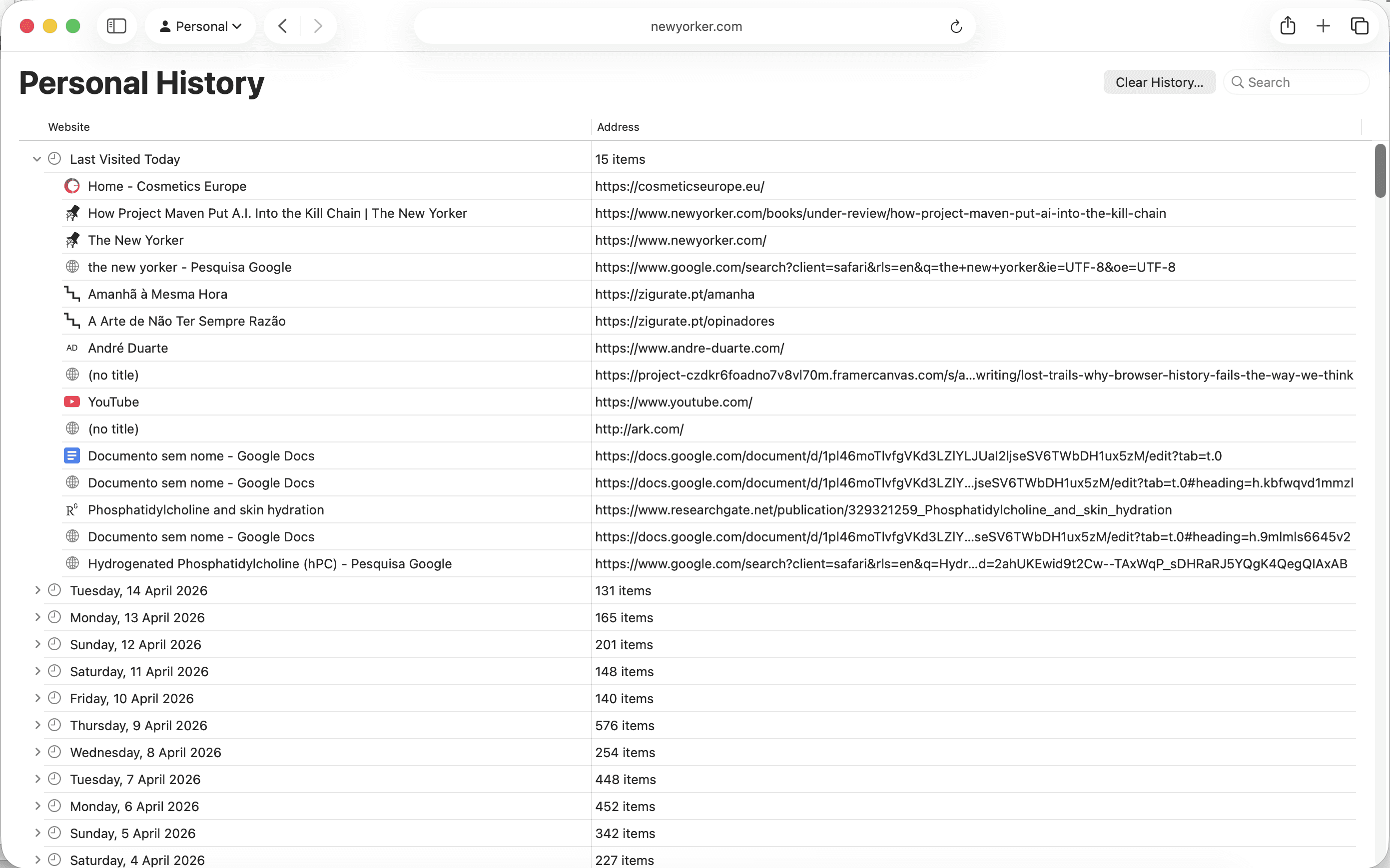
Browser history systems remain fundamentally rooted in the sequential logging mechanisms of early computing, designed for command-line interfaces and linear workflows, where chronological records made sense. But interfaces have since evolved dramatically. We’ve moved from text-based operations to multimedia rich, interactive environments, yet the underlying logic of browser history remains largely untouched, treating each entry as a disconnected URL record in a linear log faded from its surrounding context. failing to evolve in step with the web itself.
Beyond the evolution of technology itself, our behavior around information-seeking has become increasingly dynamic and adaptive. We no longer search the web as we might comb through a static archive. Instead, we refine queries iteratively, follow tangents, open tabs “just in case,” and leave multiple documents open in parallel. These browsing patterns are rarely linear, they branch, loop, and shift, demanding a history and retrieval system that mirrors this exploratory rhythm.
Information scientist Marcia Bates described this natural mode of inquiry as berrypicking: a non-linear, evolving process in which each step informs the next. Instead of launching a single, well-formed query, the user gathers fragments; an excerpt here, a citation there, a link that leads unexpectedly elsewhere. Each discovery reshapes the direction of the search. This is the rhythm of real-world information-seeking, full of loops, sidesteps, and revisions. Yet browser histories flatten this richness into a brittle chronogram, erasing the connective tissue between entries, leaving behind a trail stripped of narrative coherence.
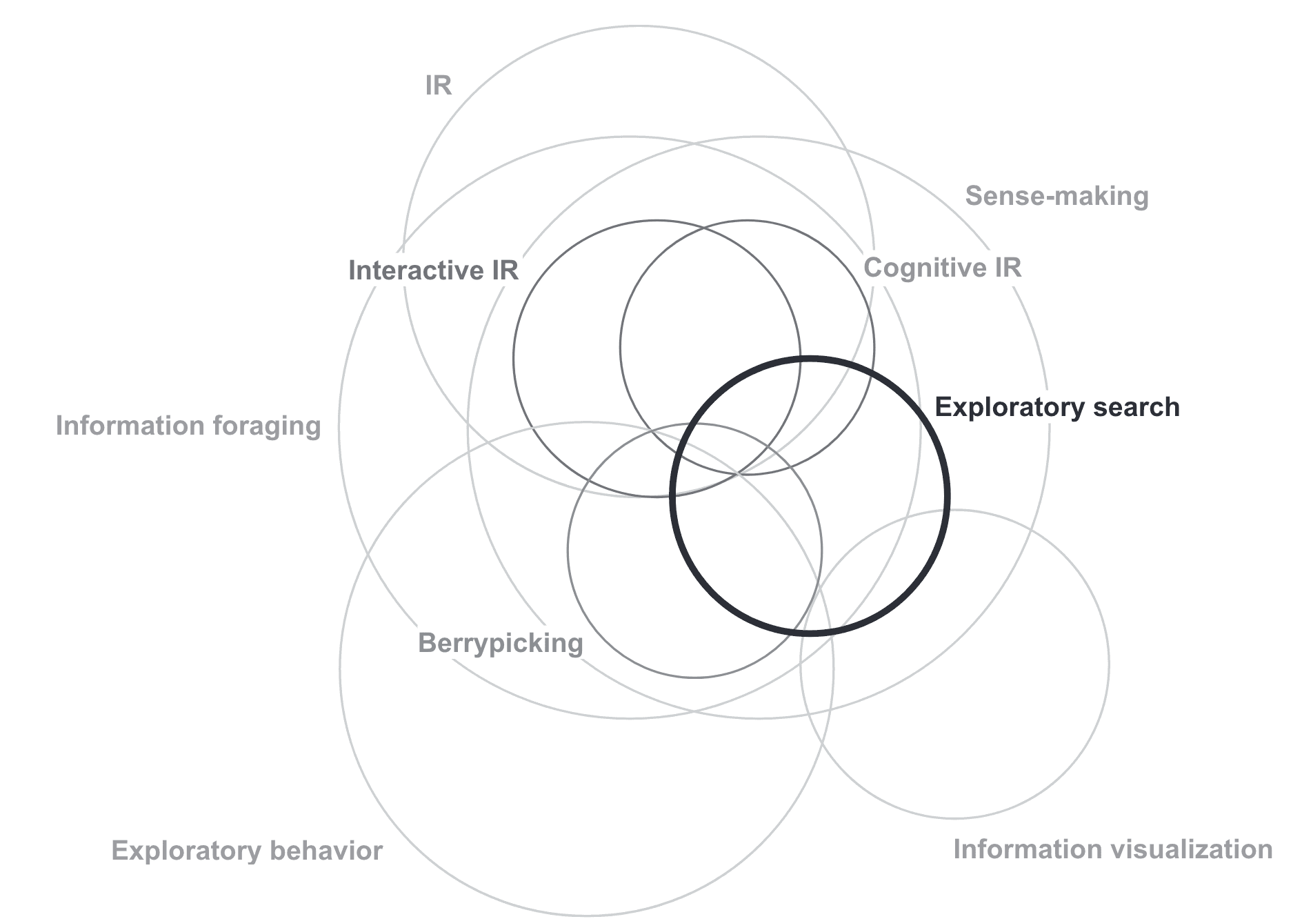
Gary Marchionini formalised this intuition further. In his 2006 framework for exploratory search, he distinguished between three types of search activity: lookup, learn, and investigate. Lookup is the discrete, well-defined query, the kind search engines have been optimised to serve. But learn and investigate are open-ended, iterative, and driven by uncertainty. The user does not arrive with a fixed question; the question changes as the search unfolds. Where Bates described the shifting path of the individual query, Marchionini widened the lens to the cognitive stakes of the entire session. Exploratory search is not just non-linear; it is driven by ill-structured problems, evolving information needs, and a constant oscillation between querying and browsing. The user scans, selects, backtracks, and reorients, blending deliberate retrieval with opportunistic navigation. This is a closer description of how most people actually move through the web on any given afternoon: not pursuing a single thread, but managing multiple concurrent uncertainties across tabs, windows, and sessions. And it is precisely this kind of activity that browser history is least equipped to support. A chronological log assumes lookup. It assumes the user knew what they wanted, found it, and moved on. Exploratory search presupposes the opposite: that the destination was never fully known, and that the journey itself produced the understanding.
In 2001, Nadeem and Killam proposed the DomainTree browser as a response to this problem: a visual history structured like a tree, with websites as parent nodes and individual pages as branches. It borrowed the logic of a book’s table of contents to make web activity more navigable. Their usability studies showed that visual and hierarchical representations significantly improved users’ ability to retrace their steps, establishing clearer relationships between content. By drawing on familiar metaphors from the physical world, this model reduced the cognitive friction typical of traditional history logs, but its insights were never widely adopted, leaving browser history largely unchanged.
Metaphorical representations drawn from the physical world are a common strategy in interface design, used to make digital experiences feel more intuitive from the first interaction. And when it comes to reflecting the navigational richness of online activity, there is still much to learn from these analog precedents. Take the physical book for instance: It offers a wealth of navigational cues such as hierarchical typography, headers, spacing, imagery, as well as user-added signposts like underlined text, marginalia, or dog-eared pages. These affordances make revisiting and retrieving content fluid and familiar. In contrast, the browser demands that users mentally reconstruct entire navigation paths from cryptic URL fragments, a cognitive burden that would be unthinkable in any well-designed physical reference system.
Although this style of browsing is very particular to the web, the broader challenge of organising layered information has been addressed successfully in many other digital interfaces. Google Maps, for instance, is a compelling translation of a paper map into a dynamic spatial interface. It allows us to zoom out to explore broad categories, restaurants, museums, hotels, then zoom in on a single point of interest, layering in real-time data like transit or traffic. A photo gallery behaves similarly: a wall of thumbnails narrows by month, then by moment; tapping a single image reveals contextual metadata, location, camera settings, even weather at the time the photo was taken. These examples all share a principle: information is layered, accessible incrementally, and organized to support memory, discovery, and depth without overwhelming the user.
Providing digital order is, in many ways, a continuation of how we’ve conceived information-rich physical spaces. Libraries, for instance, rely on systems of classification numbers, shelf signage, and floor plans, not simply to locate a single book, but to orient the user within the wide universe of knowledge. We don’t just retrieve; we browse, stumble, and find our way through structures designed to reveal relationships between things. A well-designed interface should do the same. Guiding without constraining, offering structure without flattening the richness of exploration.
Design goals
This speculative design proposal builds on the limitations described earlier around how browser histories store and display visited pages. Rather than merely logging entries linearly or relying on keyword filtering, it explores how a more visual, spatial, and dynamic model might enable users to retrace, conceptualise, and re-encounter past activity in a way that aligns more closely with how we remember, associate, and browse.
In this model, interaction is shaped less by filters or search terms and more by the scene—a layout designed to surface contextual cues, spark recognition, and allow for deeper orientation. Interfaces should present rich, glanceable compositions filled with potential objects of interest, supporting the cognitive process of reconstructing the path taken. Drawing from principles such as information scent and overview + detail on demand, the system balances visual richness and clarity, encouraging a sense of curiosity and serendipitous discovery. It also surfaces content in ways that allow users to not only access material of interest, but also understand its sequence and spatial relationships.
To support these goals, the proposal focuses on three guiding principles: hierarchical structures, generous interfaces, and gradients of immersion.
Clustering and Hierarchical Representation
When the user accesses the browser history, each parent page is displayed as an icon. Any pages visited from that source are visually grouped with it, forming a cluster that reflects the associative path of the session. Hovering over a parent icon reveals a sequenced arrangement of those child pages, allowing the user to intuitively read their browsing logic and sequence. This clustering reduces visual noise and enhances spatial understanding—highlighting not just what was visited, but how it was connected. This approach encourages spatial cognition, information scent, and memory retrieval, enabling users to re-enter their own browsing journeys with context.
Hierarchical Structures
Hierarchical layouts offer an intuitive way to explore complex systems—files, records, links, and layered content. Applied to browser history, they help users place themselves within a broader structure, making it easier to retrace steps, compare sessions, or reframe their exploration. Visual tools like treemaps or nested paths could reveal the relationships between various content sources at a glance, enabling both macro- and micro-level understanding of browsing patterns (Plaisant, 2002).
Generous Browsing
Orientation isn’t only about returning—it’s about projecting forward. Interfaces that support information scent (Pirolli et al., 2001; 2003) make it easier for users to predict what a link might contain before clicking. Effective design here means previewing not just metadata, but visual or structural hints that build expectation. For example, a node’s design could imply whether it’s a lightweight article or a dense dataset. Systems like the Hyperbolic Tree Browser demonstrate how strong cues allow users to skim vast networks without losing clarity.
A Gradient of Browsing Immersion
As users navigate, their engagement shifts—from scanning to inspecting to diving in. This principle supports that movement: the interface should allow for gliding between distant overviews and detailed inspection. Much like browsing a newspaper—where you begin with headlines and move toward full articles—users should be able to modulate their attention depending on context.
At a high level, interaction involves scanning broad scenes to get a snapshot of what’s available. This helps with orientation, not in a deterministic way, but by offering anchors to return to. Once something draws attention, the user should be able to zoom, hover, or filter down into a specific area of interest. At the most immersive level, full pages, annotations, previews, and highlights are available on demand.
This approach mirrors how people naturally seek information. As Dörk et al. (2017) describe, effective systems often allow for progressive engagement—like finding the right library aisle before locating the shelf and the exact book. Interfaces that support this rhythm enable better comprehension and flow.
Themes:
Information Architecture, User Experience, Interface Design