Redesigning browser memory
June 26, 2024
Category:
Speculative essay
The browser is now our daily cockpit: twenty open tabs, music streaming in the background, half‑read articles tucked behind a forum thread that just spawned another rabbit‑hole. Yet when we try to retrace that whirlwind, the “History” panel greets us with a bare, timestamped column of URLs—as if a plane’s black box recorded nothing but times of take‑off and landing. It is a cartographer’s nightmare: no landmarks, no rivers, no sense of where we lingered or why we veered off course.
That poverty of context is a legacy feature. Early browsers copied the simple, sequential log files of 1970s terminals—one request after another—because it was easy to implement and easier to display. The web has since become a saturated landscape of videos, interactive essays, code sandboxes, and social threads, but the algorithm behind the History button never graduated beyond pencil‑and‑paper bookkeeping.
Classic information‑retrieval systems reinforced the same linear mindset. You posed a single, well‑formed query; the database returned a ranked list; job done. This works when you already know exactly what you need. It collapses, however, when exploration is half the point—when you refine the query ten times, follow tangents, open mis‑spelled tabs just in case, and keep three promising PDFs simmering for later.
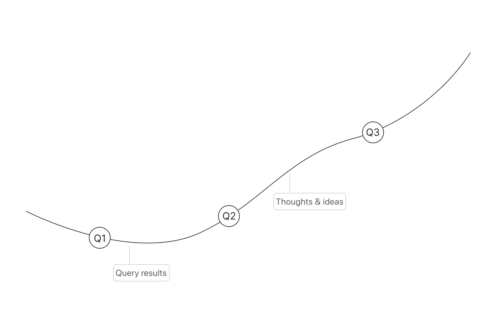
Information Scientist Marcia Bates called this contrasting style of inquiry berrypicking a non‑linear, non‑predetermined, and evolving exploratory process. Rather than starting from premises defined a priori and firing off a single, perfectly formed query, the berry‑picker gathers clues from many sources over time: a sentence here, a citation there, a link that spawns three more. Each fragment reshapes the next step, tightening the search while wandering through an ever‑widening universe of knowledge.
This duet between deliberate searching and fluid browsing creates varying degrees of immersion. A two‑second skim that rules out a page, a half‑hour deep dive that anchors a new line of thought, or a bookmark dropped into the “later” pile we may or may not revisit. Yet the moment we ask the browser to show where we’ve been, all that texture vanishes. History appears as a bare column of identical text links with no preview capabilities, no visual clues. Nothing to tell an article from an image, a video, or a PDF. The flat uniformity treats a fleeting glance and an hours‑long study as identical footprints, stripping away the context and nuance that made the journey meaningful in the first place.
Researchers have tried to fix the problem. One early prototype rendered history as a collapsible tree—parent domains as trunks, visited pages as branches. Yet two decades later most browsers still ignore the lesson. A paperback offers richer way‑finding—chapter titles, running heads, marginalia—than a gigabyte of machine‑logged browsing.
Towards user-centric browser histories
The idea isn’t new. In 1945, Vannevar Bush faced a tsunami of wartime research reports and sketched a desk‑sized machine he called the Memex. Its genius was not storage but associative trails: a scholar could tie Article A to Paragraph B with a lever click, annotate the link, and replay the chain later— or mail the reel to a colleague to pick up the thread. Bush imagined the Memex as a “future diary of the human mind,” a living map of inquiry that branched, looped, and grew with every new insight. Eighty years later our browsers can stream 4K video, yet the *History* pane still mimics a teleprinter log. The web got Bush’s information glut; it never got his trail.
Currently, browser histories reflect almost none of our nuanced interactions with the web; they offer little more than an all‑or‑nothing search box. This design assumes that so‑called “casual users” [^3] can perfectly name what they’re looking for—and that their information needs are both linear and text‑based. Reality, of course, is messier.
Imagine, for a moment, a browser with no search box at all. How would we locate something buried in our personal archive? The question sounds radical until we recall the physical library: classification numbers, shelf signage, and floor maps guide us to an author without a keyword in sight.
We already use the same spatial logic in digital products. On a map we zoom out to scan for restaurants, then zoom in on the bistro that interests us—just as a painter steps back for overall composition before leaning in for detail. A photo gallery works the same way: start with a wall of thumbnails, narrow the grid by month, then tap a single image to reveal GPS tags, camera settings, even the weather at the shutter‑click.
Why shouldn’t browser history feel just as intuitive? A history interface that supports panning, zooming, and progressive disclosure could let us sweep across months of browsing, tighten the view around a single research sprint, and finally open the page that matters—complete with highlights, copied snippets, and the side‑trails we followed to get there.
Designing for these natural, real‑world behaviours means embracing Bush’s old hope for associative trails while leveraging today’s graphics, storage, and interaction patterns to make such trails both visible and explorable.
Design goals
In this speculative design proposal essay, I aim to address the main issues associated with how current browser history mechanisms allow us to revisit previously visited pages. In particular, I was especially motivated to explore a graphically inclined interface that arranges our online footprints in a way that we can overview, conceptualise, retrace and explore, providing a set of interactions aimed at reducing the cognitive efforts associated with finding and retracing a page back to its source. In this generous history filters and keywords might become secondary. Instead, it should present rich scenes full of potential objects of interest, allowing users to process multiple items easily to form a sense of the scene. rich, dynamic information layouts balance overviews, context, and detail on demand (Shneiderman, 1996), exhibiting visual affordances as glanceable guiding elements that inform but also feed a constant sense of curiosity for serendipitous discoveries along the way, surfacing and organising elements into visual libraries that represent their variety alongside detailed preview options so not only the material of interest becomes more accessible but also it’s sequential order more understandable.
To achieve these design goals, the proposal recasts three essential principles to shape a new interface for browser history navigation: hierarchical structures, generous interfaces, and gradients of immersion.
Clustering and Hierarchical Representation
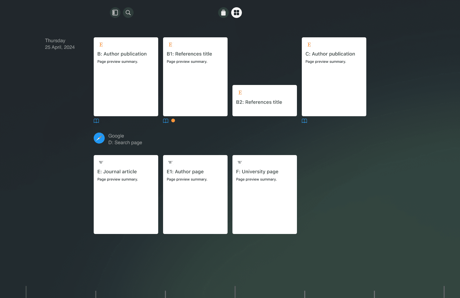
When the user accesses the browser history, each parent page on the timeline is visually represented as an icon. Pages visited from this parent page are grouped within the parent icon, forming a cluster. This clustering approach visually signifies the associative relationship between the pages. Hovering over a parent icon dynamically reveals a hierarchical sequence of the clustered pages, allowing the user to intuitively understand their browsing paths. This method not only declutters the timeline but also enhances user orientation by providing a clear visual representation of navigational dependencies and contextual relevance between visited pages. This design emphasizes the importance of spatial cognition and information scent, facilitating effective navigation and information retrieval, ensuring that users can easily trace their browsing history and comprehend the contextual flow of their online activities.

When the user opens the history, each domain represents a cluster of visited webpages. Hovering over a domain reveals a hierarchical sequence of the pages visited. Each link (B1 and B2) promptly opens a preview when hovered over, and remains fixed if clicked.
Generous browsing
Orientation isn’t just about finding your way back; it’s also about understanding what lies ahead. Here, information scent becomes crucial. Information scent refers to the cues that help users infer the content behind a link, enhancing their ability to navigate busy information collections. Interfaces that incorporate strong information scent cues can significantly improve user performance. The Hyperbolic Tree Browser, for instance, excels in scenarios where nodes provide strong cues about the content of further outlying nodes, demonstrating the effectiveness of these cues in guiding users (Pirolli et al., 2001; 2003).
Hierarchical structures
Hierarchical structures are effective mechanisms for information navigation, offering an intuitive way to manage and explore files, records, and other forms of data. Designs built upon this structure can help users situate themselves within the information space, facilitating both orientation and navigation. This makes it easier to trace their steps and understand their browsing patterns (Plaisant, 2002). Different interface arrangements, such as treemaps or indexed lists, can promote an overall visualisation of the web history space, and support users in understanding and establishing connections between visited pages and pieces of content.

The lateral panel featuring a hierarchical tree structure aids the user in navigating through pages. While swipe and drag gestures facilitate broader navigation, the tree structure offers finer control and allows for precise identification of the current page in preview. This dual approach ensures both ease of movement and detailed accuracy in locating specific content.
A gradient of browsing immersion
As cues inform the user about the information space, their receptiveness to the sources evolves. The interface should allow the user to gradually shift from abstract glimpses to detailed visualisations and targeted searches within the boundaries of the item of interest. It is akin to leafing through a newspaper, where one might start by skimming headlines and sections to get a general sense of the content and then focus more closely on specific articles of interest, seamlessly navigating the gradient between high-level overview and detailed immersion.
During high-level interaction, the user is involved in a broad engagement with information spaces, similar to browsing. The user sweeps across these spaces, scanning the scene (Bates, 2007) to gain a snapshot overview of available data. This approach facilitates a swift acquaintance with the information landscape, aiming to grasp contexts through brief, insightful glances without getting bogged down by the details of any particular subject.
As specific findings capture the user’s attention, low-level interaction complements these general overviews by involving a more focused and detailed engagement with content. Users can move, zoom in, and apply filters to narrow down the information, focusing on specific sections that are relevant to their needs. This stage allows users to refine their view and concentrate on the most pertinent data[^4].
Finally, when users need in-depth information, they can access detailed content on demand. This might involve viewing a full-scale version of a page for detailed reading, accessing a side menu with annotations and highlights, or exploring links opened from the original page. This level of interaction ensures that users can delve deeply into the content, gaining a comprehensive understanding of the material.

The detailed page preview utilizes the majority of the screen height to provide an immersive reading experience. This layout prominently displays the content of the page, allowing for detailed examination. On the right margin, visual demarcations indicate areas of highlighted text or bookmarked pages. These demarcations serve as intuitive markers, guiding the user to potential areas of interest or search matches. By visually representing these key points, users can quickly navigate to the most relevant sections, enhancing their ability to efficiently locate and engage with the desired information.
This gradual change of the scene as information is gathered is a common pattern in successful systems. For instance, a library patron might start by locating the correct aisle before homing in on the specific shelf and book, demonstrating that multiple views are essential for maximising understanding throughout the search process (Dörk et al., 2017).

The tile view effectively utilizes a larger portion of the screen space, employing an implicit ordering system based on a horizontal and vertical grid aligned with natural reading patterns, organized from left-to-right and top-to-bottom. This design features a grid layout of tiles, each representing a parent page, with the site's favicon prominently displayed within the tile. This layout is particularly advantageous for navigating image and video searches, displaying content in a visual gallery format, while also adapting well to text and mixed media layouts. The cover of each tile may default to the first page of the document; alternatively, other strategies can be employed, such as displaying the title at the top and a section of higher relevance determined by an algorithm that identifies the most interacted-with page. When a page is hovered over, associated pages maintain full opacity while pages from different trajectories are dimmed, providing additional visual cues to facilitate quick identification and intuitive navigation.
Reimagining browser histories involves more than simply providing tools to revisit information faster. By moving beyond the limitations of traditional interface patterns, we can start to think of histories as part of a 'Tool System' (Engelbart, 2003). This concept encompasses not only the visualisations of previously visited spaces but also the learning required to use these tools effectively, their production, and their integration into the broader ecosystem of digital interactions. It encourages us to shift our focus from the artefacts themselves to how they are used and how they fit within our digital workflows.
Yet, as interfaces become more flexible, they inevitably grow more complex, regardless of how polished their visual presentation might be. This raises a fundamental question: what is the optimal level of interaction that balances ease of use with added value? What guides these boundaries? Is it the immediate purpose of a browser history, or is it the untapped potential of what a browser history could become?
Exploring narrative techniques in browser histories could aid in shaping associative tracing lines across the content we consume. Eventually, such enriched histories might prompt us to consider whether these newly acquired insights should remain confined to the browser or transcend the boundaries of the app, becoming a central element of the operating system itself, potentially evolving the traditional file-in-folder paradigm.